Warm documentary Australian photography with quiet dignity.
The visual anchor for every image produced across 953 marketing assets, 7 rooms, and 12 months. Every image in the Life Without Debt production pipeline is generated from the same style prompt with per-asset subject variation, so the brand reads consistently across ads, landing pages, emails, and grant narratives — from a Room A foundation pitch to a Room F clinician email.
The canonical style anchor
This is the exact prompt string embedded in scripts/gen-production-assets.mjs and passed to every image-generation call. It is the single source of truth. Changing it is a versioned Board decision, not a designer preference.
How the anchor is composed at generation time
For every asset, the generator concatenates a per-asset subject line with the style anchor. So a Room A grant hero for the March 2027 campaign might become:
The colour palette
Palette is intentionally muted. Deep teal for authority (trust and healthcare adjacency). Warm gold for care (philanthropic accent, not corporate metallic). Cream for calm (background). No pure black, no pure white, no bright reds. Every image should read as if it belongs in a well-designed Australian magazine, not a stock library.
Do / Do not
These are the six most important instructions to any image generator working on Life Without Debt content, and to any human reviewer under HAS §8.5.
DO
- Australian domestic settings (kitchen tables, verandahs, hospital corridors, GP waiting rooms)
- Real-looking Australian faces — diverse ages, backgrounds, regions
- Natural window light, soft shadows
- Muted, earthy palette with subtle warm gold accents
- Hands, cups of tea, family objects — small human details
- 4:5 vertical for social · 1.91:1 landscape for OG cards · 1:1 square for feeds
DO NOT
- Never generate stock-glossy imagery (perfect smiles, staged conference rooms)
- Never generate US-coded scenes (snow, Christmas trees, US flags, US-style hospital sets)
- Never generate melodramatic distress (crying children, dramatic hospital-bed shots) — quiet dignity, always
- Never generate imagery that could be mistaken for a real named client (see labelled-composite discipline)
- Never use pure primary colours or high-saturation ad-tech palettes
- Never generate imagery with legible fake logos, currency, or documents
The labelled-composite discipline (for people images)
Every image that depicts a person representing a client story is a labelled composite. Composites are visibly not any single real client, and every published surface that uses one carries a small "COMPOSITE" marker. This is a governance rule, not a design preference.
Practical implications for image generation:
- Composite portraits are generated with intentional slight non-realism — subtle stylisation, softened focus at the identity-defining features (eyes, unique markers), lighting that flattens hyper-specific detail. The image reads warm and human, but is clearly a portrait-illustration rather than a documentary photograph of a specific person.
- Every composite image is captioned with the composite name (Margaret / David / Ruth / James / Aisha / Peter) and carries the "COMPOSITE" corner marker when displayed at 300px+ width.
- No image is generated with any prompt reference to a real person's name, likeness, or identifying detail from any real case file.
- Once 30 real consented cases exist, real photographs of consenting clients may enter the library on a per-case basis, with written informed consent obtained post-case-closure and captured in the compliance ledger.
Hero image library — the seventeen anchors
The seventeen images below are the visual spine of the marketing production cycle. Every downstream asset (ad_static, ad_carousel, ad_video keyframes, landing_hero, email_html header, article thumbnail) inherits or extends one of these seventeen anchors. Images marked pending are queued for nano-banana-pro generation under this build; once generated they replace the placeholder card in place.
Site-wide
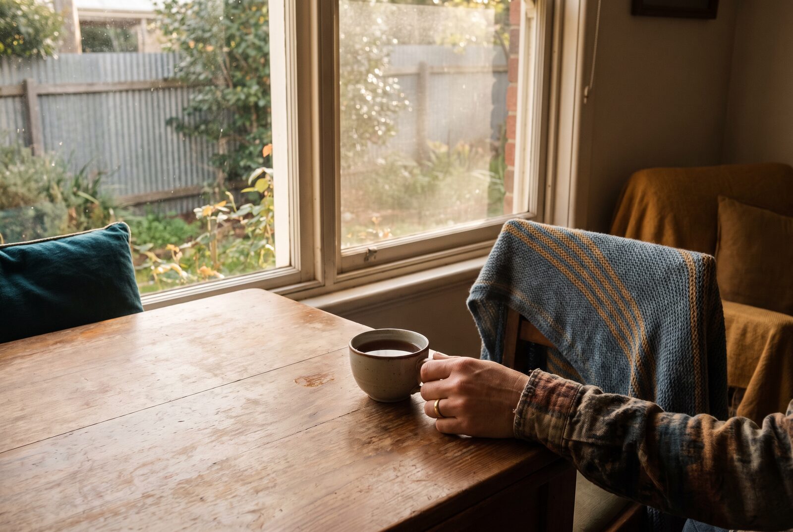
hero-lwd-main.jpg
Seven rooms

room-a-hero.jpg

room-b-hero.jpg

room-c-hero.jpg

room-d-hero.jpg

room-e-hero.jpg

room-f-hero.jpg

room-g-hero.jpg
Six composite portraits
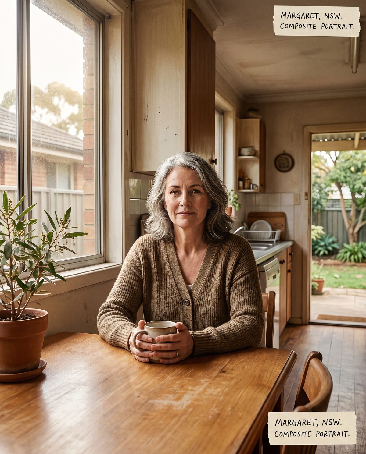
composite-margaret.jpg
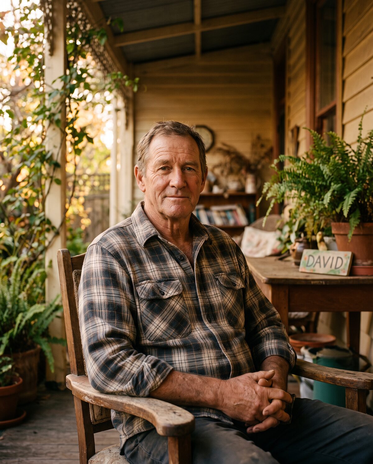
composite-david.jpg
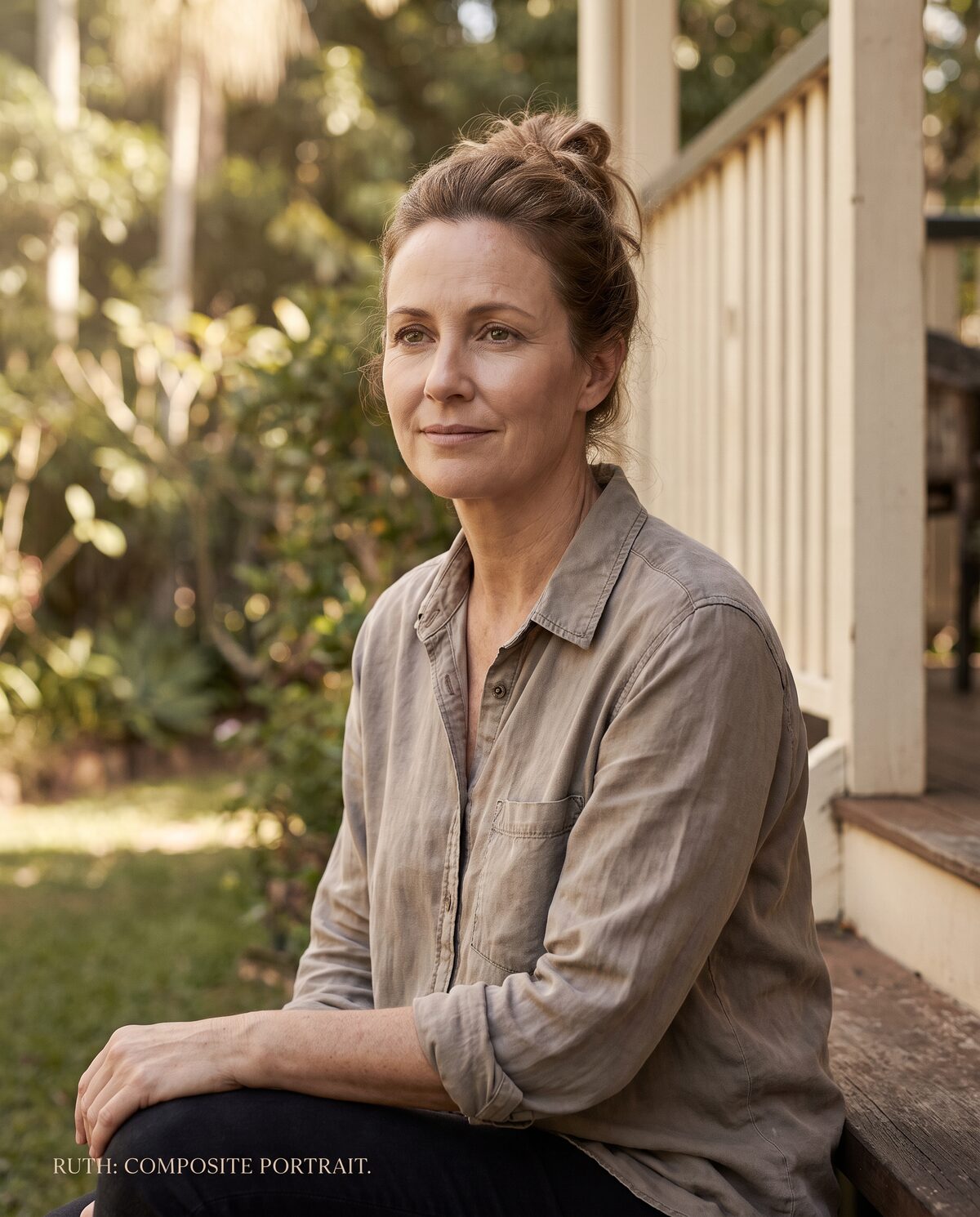
composite-ruth.jpg
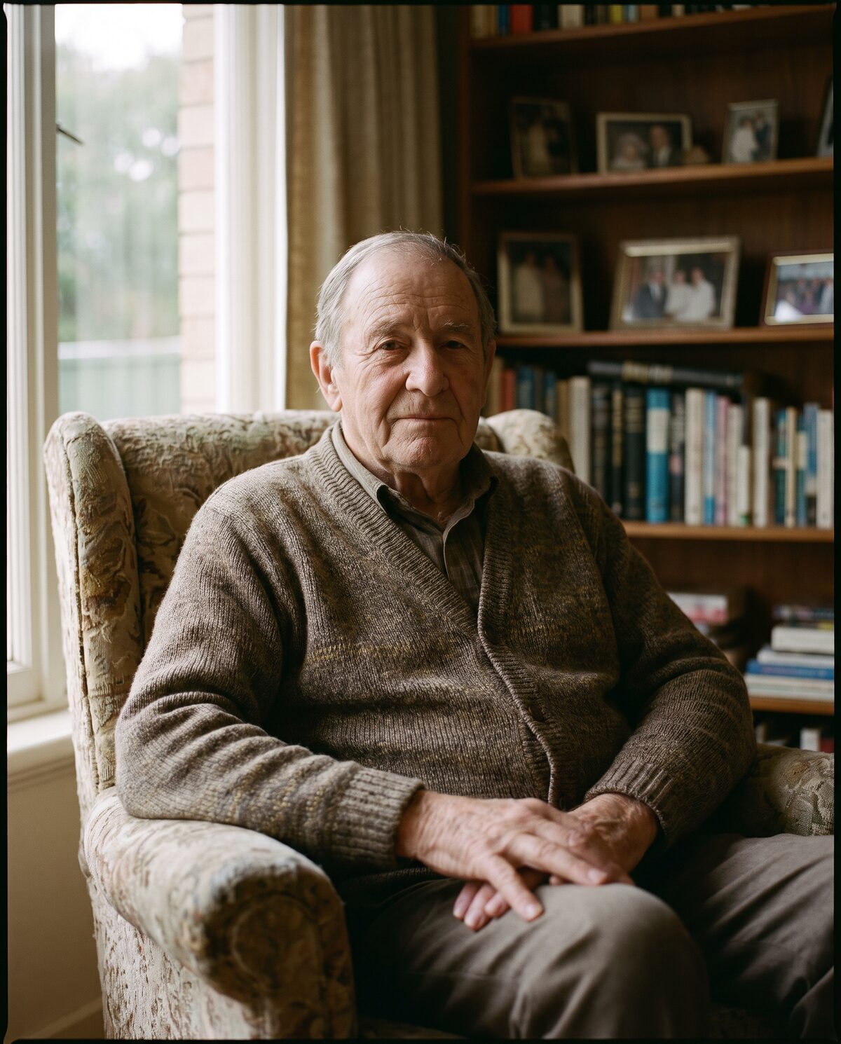
composite-james.jpg
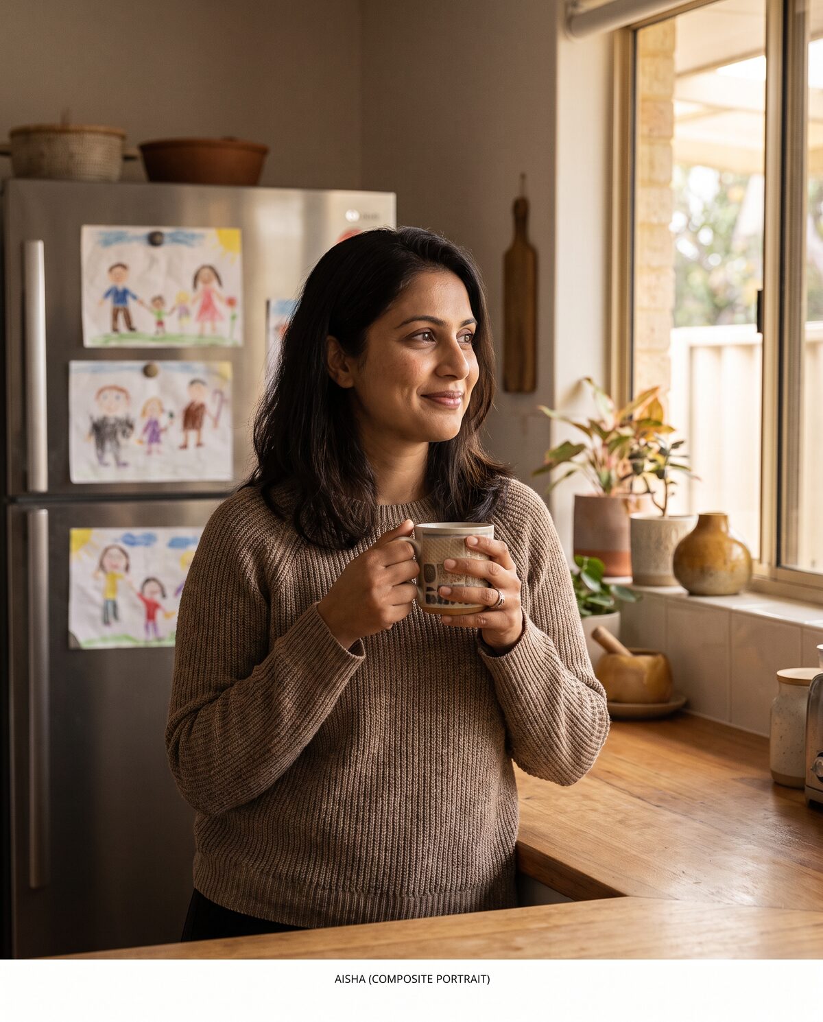
composite-aisha.jpg
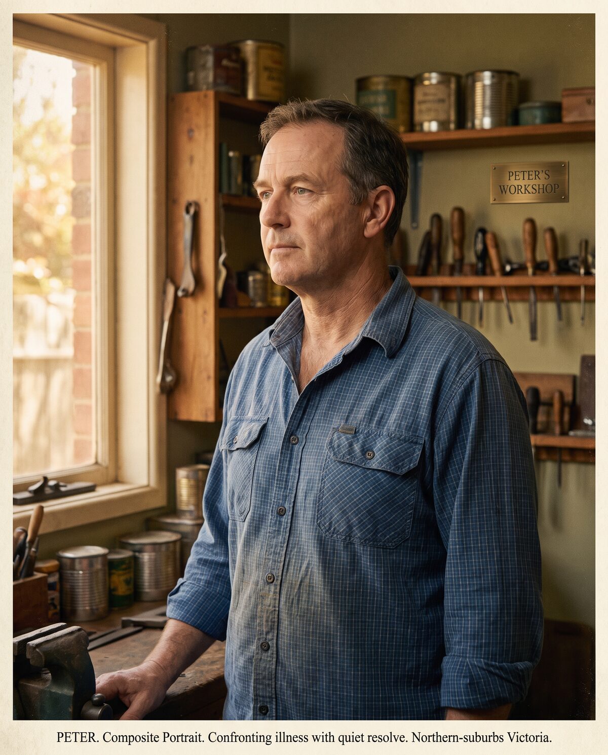
composite-peter.jpg
Impact-page illustrations

impact-advocacy-moment.jpg
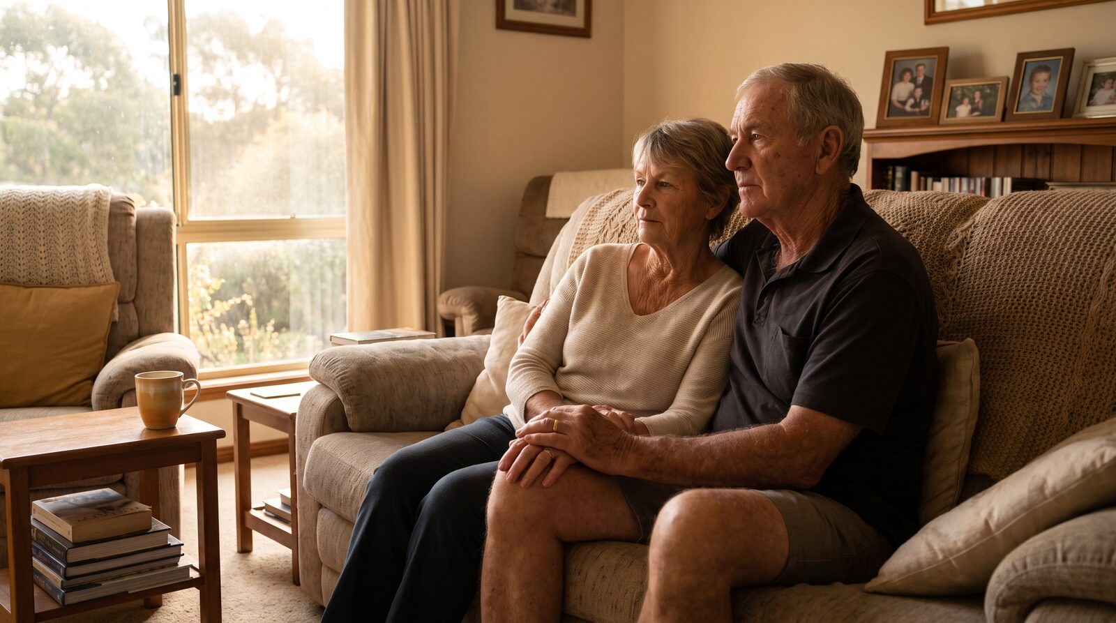
impact-family-peace.jpg

impact-evidence-base.jpg
How this guide is used at production time
Every marketing asset in the D1 production_assets table carries an image_prompt field. That field is composed at generation time as:
The subject line is drafted by the CMO Agent (HA2) or a named human (HA4) as part of the asset brief. The IMG_STYLE_PROMPT constant is invariant. This means every image in the pipeline is stylistically consistent by construction, and a human reviewer only has to check the subject line (not re-approve the visual system every time).
Compliance-flag brand_consistent
The sixth compliance flag on every asset is brand_consistent. It is the human reviewer’s attestation that both the copy and the image conform to this style guide. It must be ticked (along with the other five flags) before status='approved' can be set. This is server-enforced on the approval endpoint.